 Development
Code & design, hands-on
A space for things I build for myself — watch faces and tiles for Wear OS smartwatches, and tools and themes for WordPress.
Watch faces for Wear OS
I design and build watch faces in the WFF format — from concept and layout through data complications to publishing on Google Play. Seven so far.
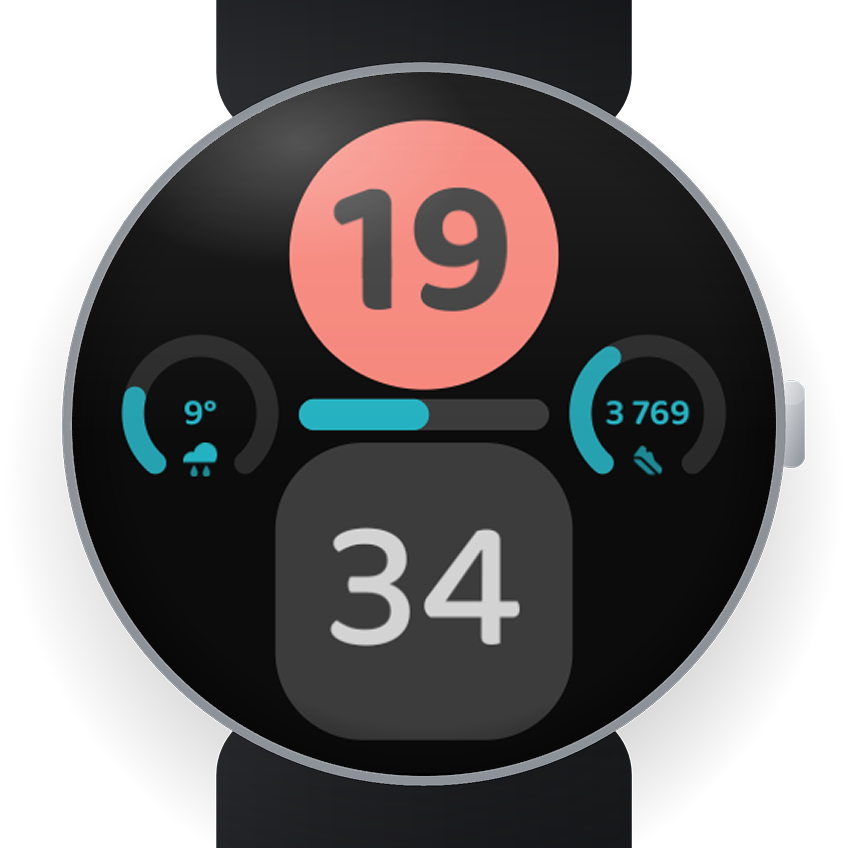
Material Digital
A clean digital face in the spirit of Material design. Configurable colours, complications and digit style.
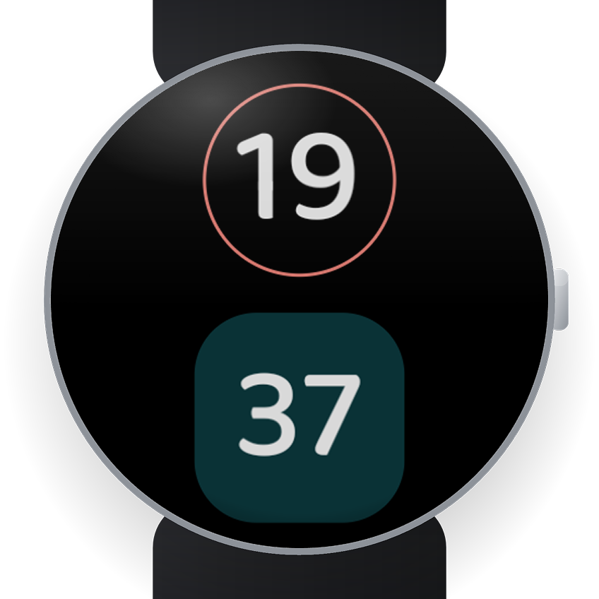
Material Digital
Bold stacked digital watch face with a dynamic accent colour and live weather.
- Big stacked clock — the hour in a filled circle, the minutes in a rounded square, in a soft rounded typeface.
- Nine accent tones (Grey, Mint, Lavender, Sky, Peach, Butter, Rose, Coral, Sage) colour the hour, the progress bar and the minutes.
- Live weather and step count as complications; a slim battery gauge across the middle.
- Always-on: the hour as a light outline, the minutes in a dark block.
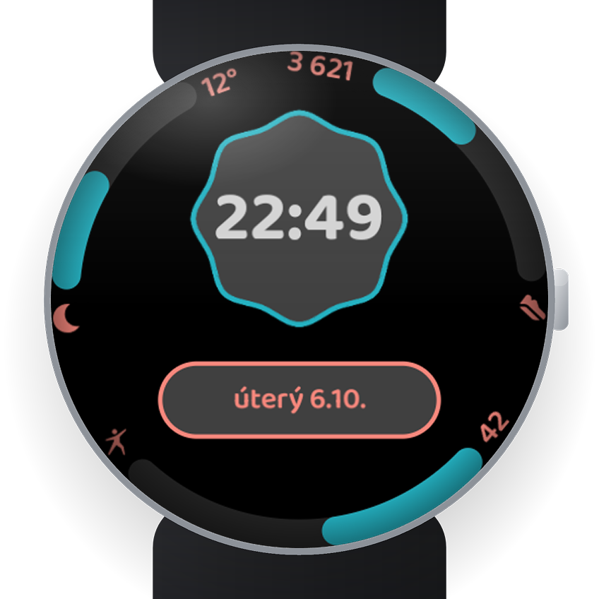
Material Digital Combi
Big clock, date pill and three rim gauges for any data you choose.
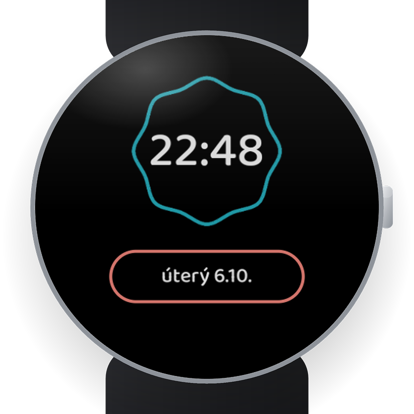
Material Digital Combi
Hi, I'm Patrik. This is my second watch face — I made it because I love a clear overview of my data and simplicity.
- The time sits in the middle on a soft scalloped shape inspired by Material design, with the day and date in a pill right below it.
- Three rim gauges — weather on the left and daily steps on the right to start with, the bottom one free for whatever you want: heart rate, battery, floors, calories… Each shows the provider's icon and value, and the arc fills in your theme colour as you near your goal.
- 21 colour themes — twelve newer two-tone ones with a second accent colour (Reef is the default, plus Graphite, Slate, Lagoon, Amethyst, Twilight, Harvest, Meadow, Rose Gold, Forest, Poppy, Admiral) and nine classic one-colour ones (Grey, Mint, Lavender, Sky, Peach, Butter, Rose, Coral, Sage).
- Always-on with colour — the screen stays pure black, with a thin coloured outline around the time and the date pill and a bright white clock and date: easy to read in sunlight, easy on the battery.
- Needs Wear OS 5 or newer. No accounts, no ads, no data leaving your watch.
Material Digital Picture
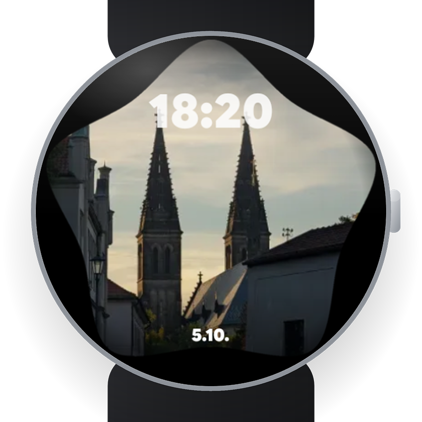
Your own Google Photos on your watch face, taking turns as you raise your wrist. Four shapes, three optional gauges, nine palettes. Needs Wear OS 6.
Material Digital Picture
Hi, I'm Patrik. I made this because I wanted my watch to show something I actually love — my own photos — and still feel like part of the Material Digital family.
- Pick one or more pictures from Google Photos on your phone; they take turns on your watch face as you raise your wrist. The time sits lightly on top, the date runs along the bottom — the picture is the star.
- Four shapes: Star, full screen · Square, full size · Star with three gauges · Rounded card with three gauges.
- Three gauges to fill with anything your watch offers — heart rate, steps, weather, battery, floors, calories. They look best with progress or range complications, so the ring fills as your day goes on.
- One accent, nine palettes — Grey, Mint, Lavender, Sky, Peach, Butter, Rose, Coral, Sage — tinting the gauges and icons.
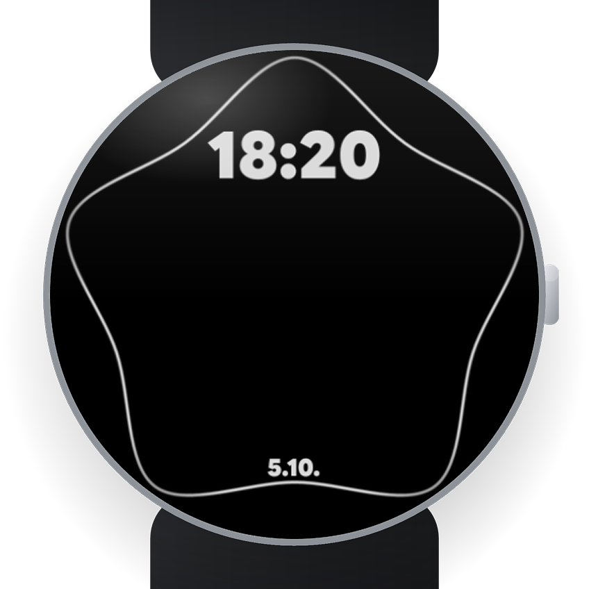
- Always-on: a clean white outline of your shape with the time and date; the photo and gauges sleep to save battery.
- Needs Wear OS 6 — the version that brings the Google Photos picker to watch faces.
- No accounts, no ads, no data flying anywhere. Your photos go from your phone to your watch and stay there; I never see them.
Material Digital Facet
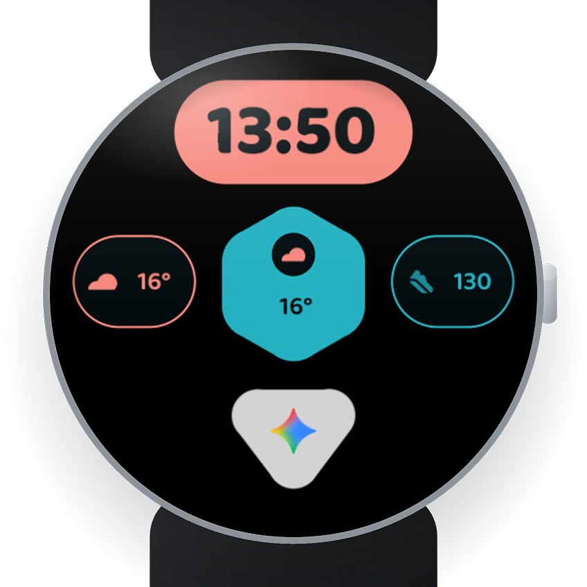
A clean geometric watch face: time, three spots for your data, one shortcut.
Material Digital Facet
Hi, I'm Patrik. I made Facet because I wanted a watch face that's clean and simple but still has some personality — a few shapes and some colour instead of clutter.
- Top — a pill with the time.
- Left & right — a card each for any single-value complication: steps, heart rate, battery, weather, a timer…
- Centre — a hexagon for the one number that matters most to you.
- Bottom — a small triangle that's a shortcut, not a data field: an app, a favourite contact or a weather icon, one tap away.
- 21 colour themes — twelve newer two-tone ones with a second accent on the hexagon and the right card (Reef, Graphite, Slate, Lagoon, Amethyst, Twilight, Harvest, Meadow, Rose Gold, Forest, Poppy, Admiral) and nine classic one-colour ones (Grey, Mint, Lavender, Sky, Peach, Butter, Rose, Coral, Sage).
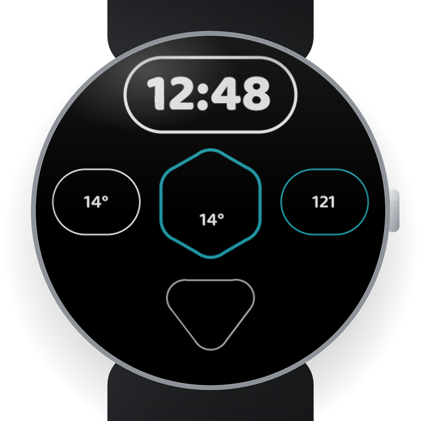
- Always-on calms everything to a thin outline, and the triangle shows how many unread notifications you have — no need to open anything.
- Needs Wear OS 5 or newer. No accounts, no ads, no data flying anywhere.
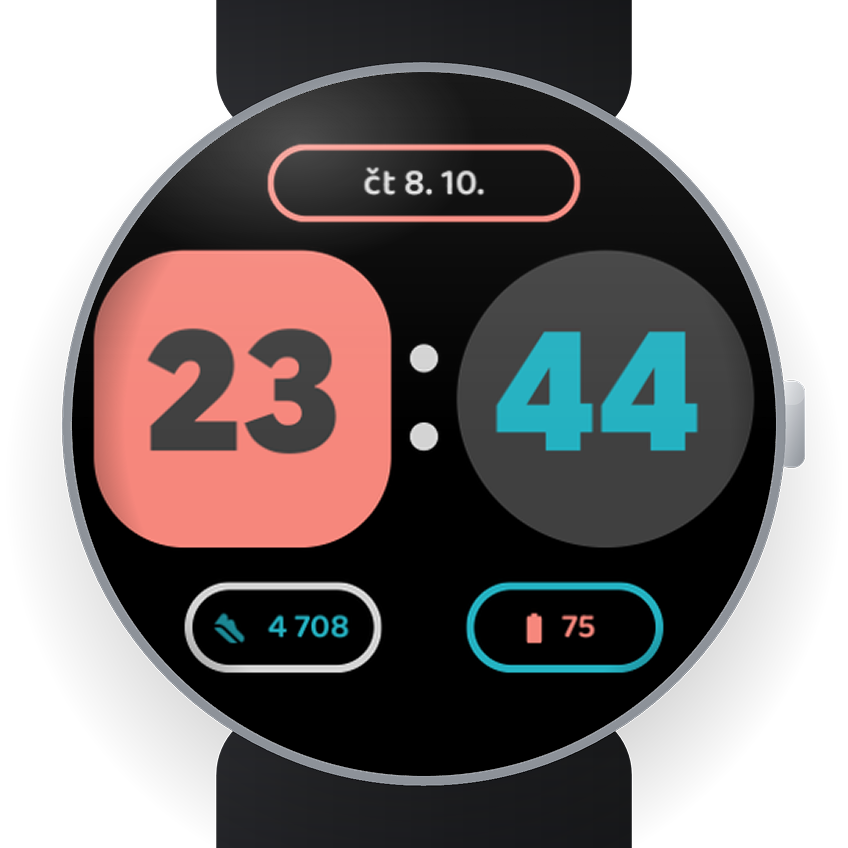
Material Digital Duo
A bold split digital clock — hours in a rounded square, minutes in a circle, a two-dot colon between. Always on.
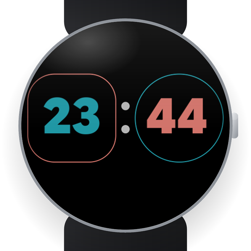
Material Digital Duo
A bold, split digital watch face — the time is the whole face.
- Black-weight digits: the hour in a rounded square on the left, the minutes in a circle on the right, a two-dot colon between.
- Top — a wide pill for a longer complication: day and date, next event, a label.
- Bottom — two small pills for a value each: steps, battery, heart rate, temperature, a timer.
- Always-on drops to thin monochrome line art — just the outlined blocks, colon and digits.
- Nine themes (Grey, Mint, Lavender, Sky, Peach, Butter, Rose, Coral, Sage) — one seed colour at three tones.
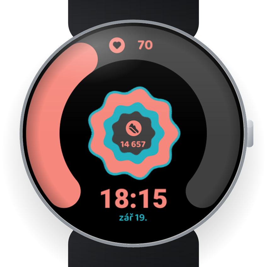
Material Digital Halo
A fat glowing ring that fills with your heart rate — and grows a second colour when you smash 100%. A nine-pointed star in the centre, 21 themes.
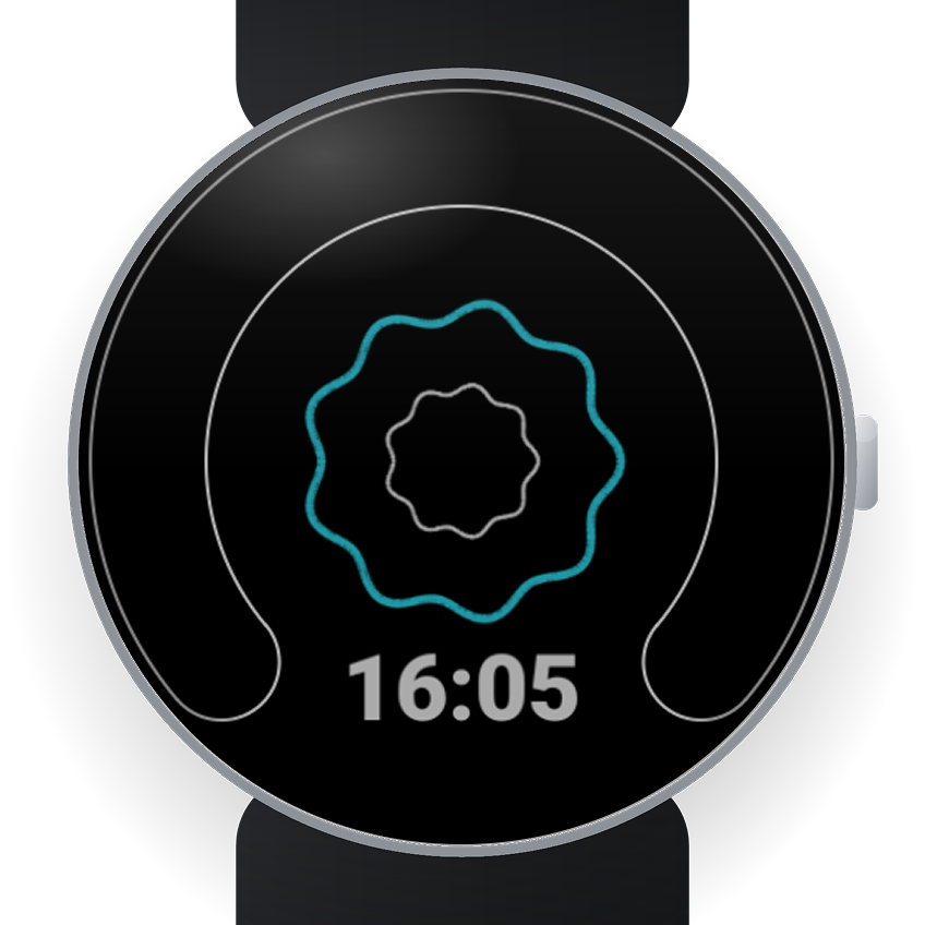
Material Digital Halo
Hi, I'm Patrik. I made Halo because I wanted my watch to feel less like a spreadsheet and more like a watch I'd actually enjoy checking.
- Ring — a fat glowing ring that fills as your heart rate (or steps, a goal, anything with a percentage) climbs. Blow past 100% and a second colour grows in from the middle, so you know you've smashed it without reading the number.
- Centre — a small nine-pointed star doing the same trick for a second stat (steps by default), with its own icon.
- Bottom — day + date by default, or any short complication; the time sits snug in the gap below the ring.
- Always-on calms everything down to thin, quiet outlines — except the star, which keeps a little wink of colour.
- 21 themes: twelve two-tone ones (Reef, Graphite, Slate, Lagoon, Amethyst, Twilight, Harvest, Meadow, Rose Gold, Forest, Poppy, Admiral) — one colour for the shape, a different accent for numbers and icons — plus the nine classics (Grey, Mint, Lavender, Sky, Peach, Butter, Rose, Coral, Sage).
- No accounts, no ads, no data flying anywhere.
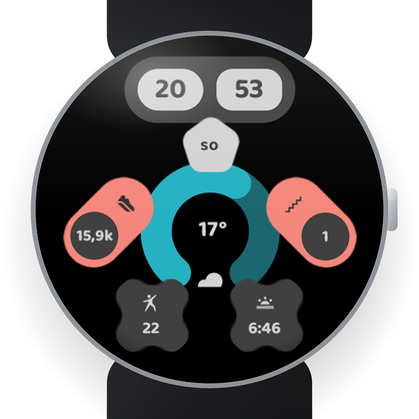
Material Digital InfoGuy
A little robot built entirely from complications — the time as his eyes, data in his arms, a ring for a torso, two more badges for legs.
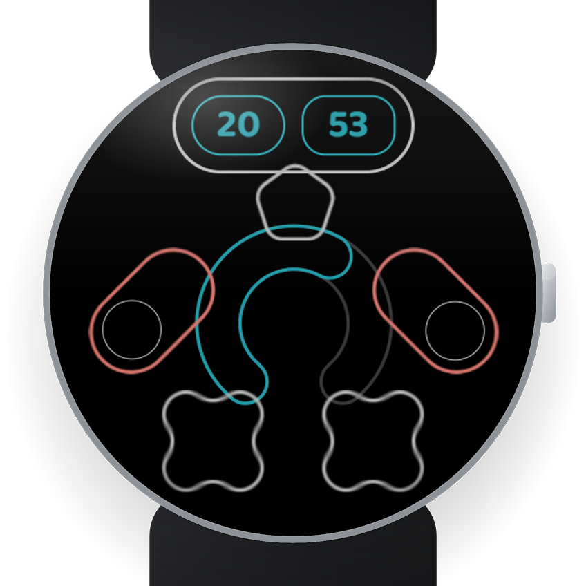
Material Digital InfoGuy
A little robot who always has your latest data at hand — inspired by Android's Material Design.
- Head — the time, split into two colourful “eyes”.
- Neck — a badge with a short text or icon complication.
- Arms (left & right) — a value + icon each: steps, heart rate, calories, weather, anything numeric.
- Torso — a ring gauge that fills with your battery, a goal or any ranged value.
- Legs (left & right) — two more complications of your pick.
- Always-on: InfoGuy traces himself in thin outline, and a small number appears at his centre when you have an unread notification.
- 12 two-tone Material Design themes (Reef, Graphite, Slate, Lagoon, Amethyst, Twilight, Harvest, Meadow, Rosegold, Forest, Poppy, Admiral) — one colour for the shapes, a distinct accent for every value and icon. Reef is my own.
- No accounts, no ads, no data flying anywhere.
Material Watch tiles
Swipe from the watch face — a tile with exactly what you want, arranged how you want.
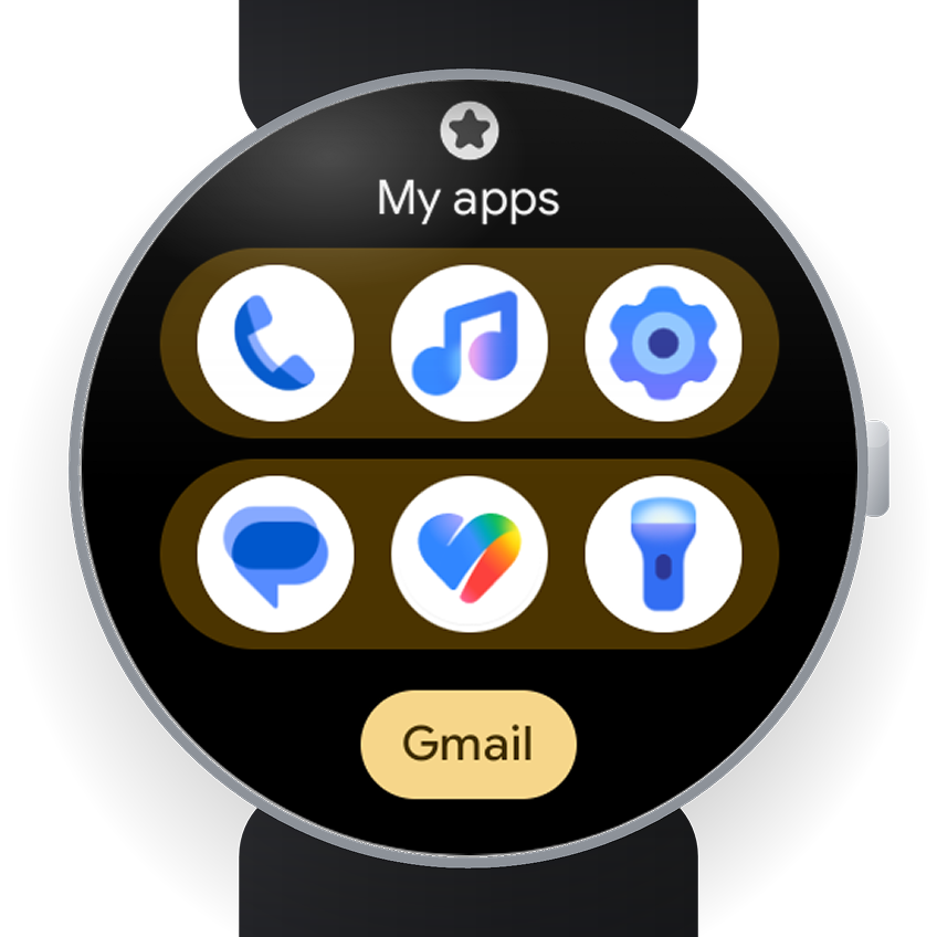
Favourite Apps
Six apps you pick, in two blocks of three, in your order — not alphabetical. Plus one text-only shortcut.
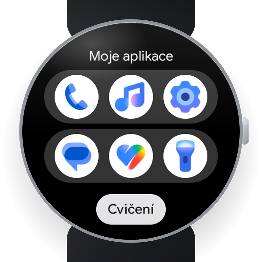
Favourite Apps
Your six apps, one swipe from the watch face — in the order you choose.
- The stock app list locks you to a three-wide A–Z grid. This is one tile with six apps you pick, arranged how you want.
- Two rounded blocks of three; move any cell earlier or later — it is never re-sorted for you.
- One name-only shortcut pill under the grid for the app you open by word, not icon.
- Editable title, set from the watch; nine colours matching the watch-face picker.
- Configured entirely on the watch — the settings screen is a live preview of the real tile.
My colour themes
All my watch faces share the same two colour systems, so they feel like one family. Go for the classic one-colour look, or for the more advanced two-colour one.
Custom themes 1.0
One seed colour, three tones
The classic set. Every theme grows from a single colour in three tones: a light one for the shapes, a mid one and a deep one for text, icons and gauges. Calm, tidy, and it never clashes.
- Grey
- Mint
- Lavender
- Sky
- Peach
- Butter
- Rose
- Coral
- Sage
Custom themes 2.0
Two colours, one family
The advanced set. Every theme is a full six-tone palette: a soft base colour for the shapes, a second and bolder accent for numbers, icons and gauges, and light and deep tones of both for contrast. The second colour makes the data pop.
- Reef
- Graphite
- Slate
- Lagoon
- Amethyst
- Twilight
- Harvest
- Meadow
- Rose Gold
- Forest
- Poppy
- Admiral
WordPress plugins
Tools I build to fit the job — from interactive calculators to store management.
Financial calculators
A set of calculators (income protection, mortgage, repayments) merged into one plugin with a unified glass design. Real-time results.
Store management plugins
Custom plugins for running the shop, plus a range of smaller improvements and automations.
Newsletter plugin
My own newsletter plugin with an interactive template builder and email sending.
Web design
Full visual work — from concept through design to code.
E-shop redesign
A complete visual redesign of the store, plus an admin tailored to how the shop is run.
Custom websites
Websites built to order — end to end, from concept through design to code.
Custom theme
A fully custom WordPress theme — bespoke header and footer, animated background and a toggleable admin redesign.